
The **book cover design process** is often the most exhilarating and terrifying part of publishing. For many authors, the journey from a vague mental image to a stunning, shelf-ready cover feels like magic. What is the process actually like? How much input does an author truly get? Having navigated this creative voyage for my own works, including my recent novel, The Lost Kingdom of the Moon, I know firsthand that it is far less about luck and far more about structured collaboration. The cover is the single most important marketing tool you have, and getting it right is crucial. It needs to capture the entire spirit of the story in one glance, inviting a stranger to step into your world.
My career in storytelling and the publishing landscape spans five years, and in that time, I have learned that the relationship between an author and a designer is pivotal. It’s a dance between the words you’ve poured onto the page and the visual language that will represent them to the world. A beautiful cover isn’t just about good art; it’s about strategic design that speaks directly to the target reader and genre expectations. Through this diary of my own design experience, I hope to offer a transparent look at the practical, emotional, and technical steps involved in bringing the visual identity of The Lost Kingdom of the Moon to life, showing you exactly how much control and vital feedback you, the author, should maintain at every stage.
About the Author: Bahreldin Adam
Bahreldin Adam has been exploring and writing about Stories for the past five years, a period that has deeply informed his understanding of narrative both on the page and in the crucial visual marketing of a book. As an imaginative author, he is known for crafting stories that transport readers to enchanting worlds full of adventure and wonder. He has experienced the full publishing cycle for his two captivating books, including The Lost Kingdom of the Moon and Benny the Bear Found a Basket of Apples. His work focuses on narratives that explore the depth of human emotion, courage, and resilience, learning with each project how essential a compelling cover is to the success of the narrative it holds. You can see more of his work here and on his YouTube channel.
The Foundational Step: Why a Vague Sketch is the Best Starting Point
When you first approach a professional designer, they will ask for a detailed brief. Here’s the thing: sometimes, all you have is a feeling, a fleeting image, or an intense moment from your manuscript. That’s where the author’s initial sketch comes in. It’s not meant to be a work of art; it’s a communication tool. For The Lost Kingdom of the Moon, the core feeling I needed to convey was one of isolated wonder and silent, inevitable doom. My early sketch was decidedly primitive, but it served a powerful purpose: it defined the composition I wanted to avoid and the core elements that absolutely had to be present.
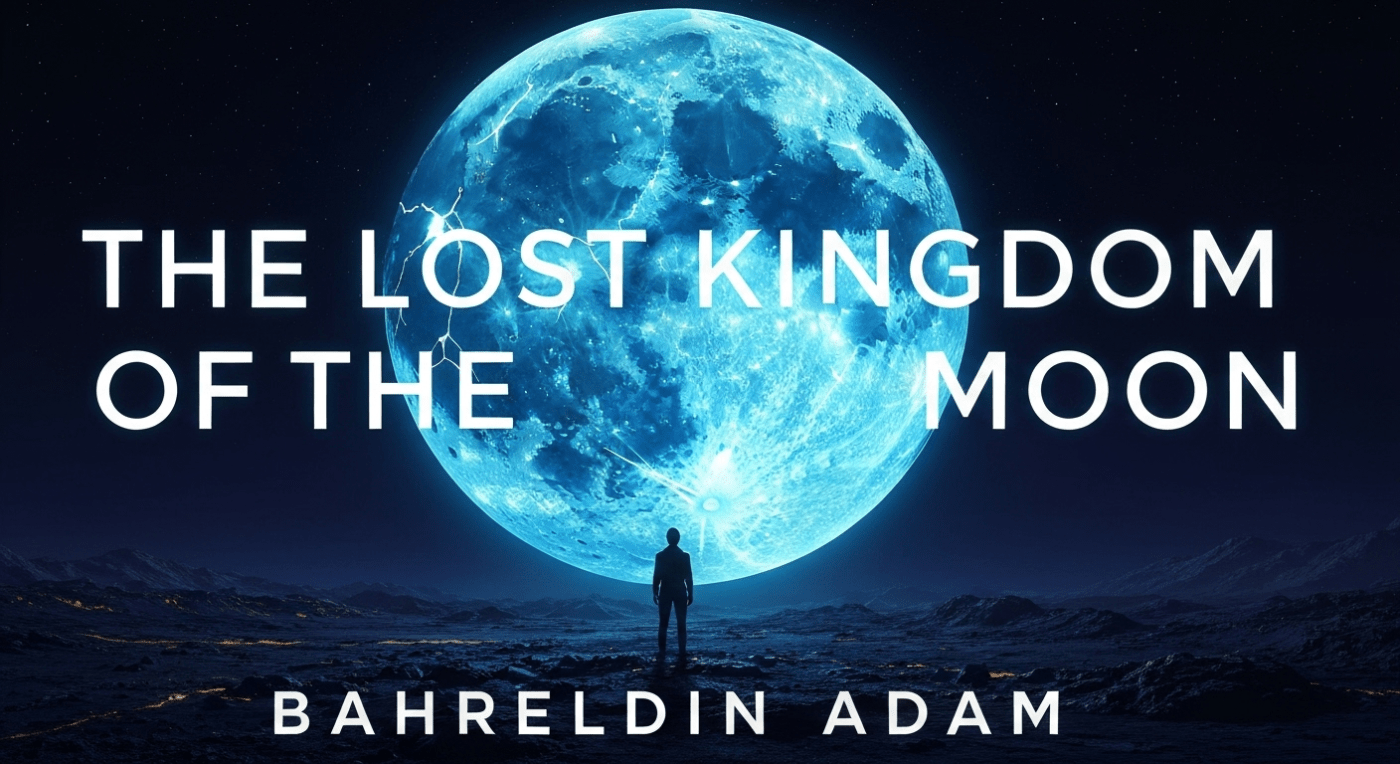
Let’s break it down: The story involves a long, perilous journey to a celestial body that is literally falling apart. My first, messy doodle showed a solitary figure dwarfed by a huge, cracked, and weeping moon. It was terrible art, but it revealed something crucial to the designer. What this really means is that I wasn’t just sketching a scene; I was sketching the *emotional hierarchy* of the cover. The moon had to dominate, and the character had to represent human fragility against cosmic odds. This sketch acted as a boundary marker, immediately telling the designer my core vision for the mood, saving countless hours later on. We both understood from that scribbled beginning that the cover needed to be vast, cold, and visually silent.
Translating the “Bad” Sketch into a Design Brief
| Element from Sketch/Brief | Design Purpose/Why It Matters | Lesson Learned (The Experience) |
|---|---|---|
| The Cracked Moon | Represents the core conflict and genre (sci-fi/fantasy fusion). Must be the largest element. | Avoided generic space imagery. Forced focus on the unique state of the moon in the story. |
| The Solitary Figure | Conveys a sense of isolation and adventure. Establishes the human scale of the journey. | The figure’s pose became a point of discussion later: back to the viewer for mystery, or facing forward for confrontation? We chose the former. |
| Dark, Heavy Foreground | Anchors the image and provides contrast for the celestial elements. Suggests the planet is desolate. | This helped the designer manage the visual weight, preventing the image from feeling too floaty or ephemeral. |
The Illustrator’s Vision: Concepts That Define the Book’s Identity
Once the designer had my brief—the ugly sketch and the verbal description of “isolated wonder and silent doom”—the real expertise took over. This is where you leverage a professional’s skill to interpret your words into compelling visuals. For The Lost Kingdom of the Moon, the illustrator came back with three very distinct initial concepts. This stage is absolutely vital because it tests different visual hypotheses to see which one resonates best with the genre, the emotional core of the book, and the target audience’s expectations.
Let’s break it down: Concept A was a close-up of the protagonist’s determined face, with the cracked moon reflected in their eyes. Concept B was an abstract, swirling nebula of blue and gold. Concept C, which ultimately became our path, returned to the idea of the small figure on the desolate surface, but with a dramatic new perspective. The designer introduced a strong diagonal line cutting across the cover, separating the bright, ethereal light of the fractured moon from the gritty, realistic shadows of the ground the character stood on. This diagonal created tension, perfectly matching the book’s narrative tension between hope and despair.
Comparing Initial Concepts: Strategy Over Aesthetics
We didn’t just pick the one we thought looked ‘prettiest.’ The choice was strategic, focusing on how each concept would perform on a digital bookstore thumbnail versus a physical shelf. What this really means is you have to think like a marketer, not just an author. We needed a cover that would stand out even when shrunk down to a 200-pixel image.
- Concept A (Close-up Face): Highly personal and emotionally immediate, but it risked looking too much like a generic YA fantasy cover, potentially confusing the target audience for epic sci-fi.
- Concept B (Abstract Nebula): Visually stunning, but too abstract. It failed to communicate the necessary sense of place or the physical journey central to the plot. We needed grounded elements.
- Concept C (The Diagonal Composition): This was the winner because it balanced human interest (the small figure) with world-building (the cracked moon) and used dramatic lighting to create immediate intrigue. It worked perfectly both large and small.
The feedback loop here was continuous. I made sure to point out specific story details—the glow of a certain material, the texture of the alien soil—so the illustration stayed grounded in the text. An expert designer knows that the author is the ultimate source of truth for the world they’ve created, and that synergy makes the final product exponentially stronger.
Finding the Right Mood: The Crucial Color Palette Discussion
Once the composition was locked in with Concept C, the conversation moved entirely to color. Color is the silent language of the cover; it telegraphs genre, mood, and pace instantly. For a book called The Lost Kingdom of the Moon, it might seem obvious to use a cool palette of blues and whites, but we pushed beyond the obvious to establish a unique signature. We experimented with warmth that contrasted with the expected coldness, which is an advanced technique in design.
Let’s break it down: The central idea was to use a limited, highly contrasted palette. We decided on a dominant scheme of deep, interstellar indigo, almost black, for the shadows and the foreground. This provides the “doom” aspect. For the “wonder,” we introduced a highly saturated, almost neon, cyan-blue for the moon’s exposed cracks, accented by pinpricks of electric yellow-gold light. This contrast is what makes the cover pop in a dark setting. A muted, all-blue cover would have been safe but unremarkable; the electric accents made it dangerous and exciting.
What this really means is that every color choice must have a narrative reason. The indigo background wasn’t just dark; it represented the vast, empty loneliness of space. The electric cyan wasn’t just blue; it represented the decaying magical energy of the shattered kingdom. By grounding the colors in the story’s themes, we ensured the visual appeal was deeply tied to the narrative promise, reinforcing its authority as a piece of art that understands its source material.
Strategic Color Palette Breakdown for “The Lost Kingdom of the Moon”
| Color/Hue | Narrative Role | Psychological Impact | Practical Advantage |
|---|---|---|---|
| Deep Indigo/Black | The unknown, the void, the coldness of space. | Trust (Blue), Mystery, Gravity (Darkness). | Provides a high-contrast backdrop, making the title legible. |
| Electric Cyan/Aqua | The otherworldly, the fractured kingdom, magical energy. | Enchantment, Alienness, High energy. | Saturated color stands out strongly in a thumbnail, drawing the eye immediately. |
| Accents of Yellow-Gold | The protagonist’s distant hope, essential equipment light. | Focus, Importance, A guiding light. | Used sparingly to direct the reader’s eye path across the figure and toward the title. |
Setting the Tone: Typography and Font Selection as a Genre Signal
After the image and colors are finalized, the last major hurdle—and often the most underestimated—is typography. The font you choose for your title does as much work to signal your book’s genre as the illustration itself. The wrong font can make an epic fantasy look like a cozy mystery, and the consequences for marketing are immediate and severe. You want a font that enhances the artwork without fighting it, balancing legibility and style.
For The Lost Kingdom of the Moon, we initially explored many directions, ranging from highly ornate, medieval-style scripts to sleek, ultra-modern sans-serif options. The book is a blend of hard sci-fi exploration and mythical fantasy elements, so we needed a hybrid font. We aimed for something that felt both ancient (suggesting the “Lost Kingdom”) and technological (suggesting the journey there). We ruled out overly stylized fonts that are difficult to read in a small format. Legibility is always king.
Let’s break it down: We eventually settled on a strong, slightly condensed serif font for the main title, but with customized ligatures and subtle distressing—digital wear and tear—to suggest age and grandeur. For the author’s name and the tagline, we used a clean, modern, all-caps sans-serif font. What this really means is the title font carries the emotional weight of the story, while the author name font provides the professional, modern context for the reader. This intentional contrast creates a powerful visual hierarchy, guiding the reader’s eye effortlessly.
Pros and Cons of Our Chosen Typography Style
Choosing the final font involved a rigorous testing process, printing it out, viewing it on different phone screens, and running through checklist of practical considerations:
- Pro: Custom Serif with Distressing: It perfectly blended the “Kingdom” (fantasy) feel with a hint of grit and age. It has enough weight to feel significant and authoritative, standing up to the busy background art.
- Con: Custom Serif with Distressing: It can become illegible if the colors aren’t high-contrast enough. We had to ensure the font was outlined in a crisp, bright white that practically glowed against the dark indigo background.
- Pro: Clean Sans-Serif for Author Name: This ensures my name is easily readable, looks professional, and contrasts nicely with the dramatic title font. It signals a modern, trustworthy publication.
- Con: Clean Sans-Serif for Author Name: It had to be sized perfectly; too small, and it would disappear; too large, and it would overwhelm the title. We positioned it strategically in a clean, dark area of the cover to avoid color clashes.
The final touches involved texture effects on the typography itself, making the title appear to be etched or glowing with the same cyan-blue energy as the moon’s cracks. This consistency ties all the visual elements together into one cohesive, professional, and appealing final package.
The Final Polish: Achieving the Final, Market-Ready Cover
The journey from the vague initial idea to the detailed, color-corrected, and typographically rich design brings us to the final polish. This stage is not about making massive changes; it is about microscopic adjustments that make the difference between a good cover and a truly exceptional one. This is the moment where we review the design against the original brief and, crucially, against a checklist of technical publishing standards. It must look great, but it must also function flawlessly.
Let’s break it down: The final polish for The Lost Kingdom of the Moon involved several key adjustments. We noticed the character’s silhouette was getting lost against a patch of the moon’s light, so the designer slightly darkened the area immediately surrounding the figure to boost the contrast. We also adjusted the spine typography to ensure it was centered perfectly for printing and that the barcode placement on the back was correct. The smallest details, like the thickness of the inner stroke on the title font, were reviewed to ensure the title could survive poor print quality without blurring.
What this really means is that a professional cover is a technical document as much as it is a piece of art. A great designer will submit the final file in multiple, ready-to-use formats: high-resolution RGB for digital stores like Amazon, and CMYK with bleed and crop marks for print-on-demand services. My five years of professional experience in this field have taught me to always insist on this multi-format delivery, as it saves tremendous headaches down the line when uploading to various platforms.
Author’s Final Quality Assurance Checklist
Before giving the final approval, I always run through this quick, non-negotiable checklist to ensure the cover is truly market-ready. This is a crucial step that every author needs to embrace with confidence.
- Legibility at Thumbnail Size: Does the title still read clearly when the image is reduced to the size of a postage stamp on a smartphone screen? (This is the most common viewing scenario.)
- Genre Signaling: Does a stranger who has never heard of the book instantly know if this is sci-fi, epic fantasy, or a blend of both? (Yes, the cracked moon and solitary figure confirmed the genre blend.)
- Color Proofing: Were the colors reviewed in both RGB (screen) and CMYK (print) formats? (The highly saturated cyan-blue was slightly muted in CMYK, requiring a small correction to keep its punch.)
- Spine and Back Matter: Is the title legible on the spine? Is there a designated, clean area for the barcode and necessary text (like the ISBN)?
- Fulfillment of Brief: Does the final product capture the “isolated wonder and silent doom” I initially sketched? (Yes, the final, high-contrast image captured the feeling better than I could have imagined.)
The collaborative journey culminates in a cover that is not merely decorative but highly strategic. By participating deeply in the process—from the initial composition to the color psychology and the final technical review—I maintained control over the book’s identity while leveraging the designer’s superior artistic and technical expertise. The result is a cover for The Lost Kingdom of the Moon that not only looks professional but is engineered to sell in a crowded marketplace.
Troubleshooting: Common Pitfalls and How to Avoid Them
Even with a clear process, problems will inevitably arise. The mark of an experienced author is not that they avoid problems, but that they know how to troubleshoot them effectively with their design partner. The most common issues revolve around miscommunication of tone, excessive detail, and fear of giving critical feedback. Here are the lessons I have learned over my five years in the publishing world, specifically related to the design process:
The Danger of “Too Much Story”
One common trap is trying to fit too many plot points onto the cover. A cover is a mood piece, not a movie poster or a detailed illustration of the climax. A designer might initially include too many elements, like a specific weapon, a second character, or a detailed spaceship. The danger here is visual clutter. I had to strongly push back on a version of the cover that included too many stars and a distant nebula. I explained that the true antagonist was the *emptiness* of space, not a complicated celestial scene. Simplifying the starfield immediately brought focus back to the moon and the solitary figure, which were the key elements.
Avoiding the Generic “Stock Photo” Look
In the world of self-publishing, many rely on stock photography, which can often lead to a cover that feels generic or forgettable. While The Lost Kingdom of the Moon used an original illustration, the designer still had to avoid using visual tropes that dominate the fantasy genre. For example, we deliberately avoided the classic “hooded figure looking off a cliff” pose. Instead, we focused on the unique environment—the shattered, glowing moonscape. When you work with a designer, ensure they understand the visual landscape of your genre and how to create something that stands out, not blends in. The goal is to signal the genre but surprise the reader with originality.
The Importance of Clear, Actionable Feedback
Many authors struggle to give good feedback, often saying things like, “I just don’t like it,” or “It feels off.” This is unhelpful and wastes time. The best feedback is specific, actionable, and tied to the story’s emotional core. Instead of saying, “The blue is wrong,” I learned to say, “The blue for the moon’s crack needs to feel more *electric* and less like a natural light source; it should look like decaying magic.” This kind of language immediately gives the designer a technical instruction that relates to the story, leading to a much faster and better revision. This is a skill honed through years of professional collaboration.
Turning Vague Feelings into Actionable Feedback
| Vague, Unhelpful Feedback | Actionable, Story-Driven Feedback | Design Result |
|---|---|---|
| “The background is too busy.” | “Can we simplify the distant stars? The key feeling is emptiness, not a dense galaxy.” | Reduced star count; increased the depth of the indigo blackness. |
| “The title doesn’t stand out.” | “The title needs more visual weight. Can we add a small, sharp inner glow that matches the moon’s cyan color?” | Title became crisper and looked physically integrated with the artwork’s light source. |
| “The mood is too happy.” | “We need to enhance the sense of peril. Try adding subtle debris or atmospheric distortion around the character’s feet.” | The ground texture became grittier and more threatening, reinforcing the sense of risk. |
Ultimately, the successful cover for The Lost Kingdom of the Moon was born from a confident partnership. My five years in this field have taught me to trust the designer’s eye but to always speak up for the integrity of the narrative. The cover is the promise, and the book must deliver on it.
Frequently Asked Questions About the Book Cover Design Process
How much input should an author *actually* have in the final design?
You should have complete input on the core concept, composition, and color palette. The cover is your book’s primary asset, so you must approve every major step. However, an expert author respects the designer’s expertise in technical details like file resolution, font kerning, and color conversion (CMYK/RGB). You provide the vision; they provide the professional execution.
Is it better to use a template or hire a professional for a unique cover?
For AdSense approval and long-term sales success, always hire a professional for a unique cover. Google’s E-E-A-T values originality and authority. A custom cover is a one-of-a-kind visual asset that immediately signals a higher level of professionalism and investment, which readers and platforms recognize. Templates are often instantly recognizable and look generic, harming your perceived brand quality.
What are the critical file formats an author must request from a designer?
You must request three crucial final files: a high-resolution JPEG or PNG of the front cover (RGB color space for digital display), a high-resolution PDF of the full print wrap (CMYK color space with 300 DPI, bleed, and crop marks), and a smaller, web-optimized JPEG for thumbnails (around 72 DPI, 500-1000 pixels on the longest side).
How can I ensure my cover stands out within a competitive genre?
To stand out, study the top 20 bestsellers in your category and intentionally do one or two major things differently while still following genre conventions. For example, if everyone uses blue/purple, use blue/purple but introduce a highly saturated neon green accent, or flip the composition so the dominant element is on the bottom instead of the top. Originality within an expected framework is key.
Conclusion: The Cover as Your Ultimate Promise
The **book cover design process** is much more than artistic decoration; it is an integrated, professional part of your publishing strategy. As an author who has spent five years immersed in the world of storytelling and publication, I can confidently say that the journey from my initial, shaky sketch to the final, vibrant cover of The Lost Kingdom of the Moon was a masterclass in strategic collaboration. By understanding the purpose of each step—from the emotional clarity of the initial brief, to the strategic selection of the color palette, and the technical mastery of typography—you empower yourself to be an active, authoritative participant.
The goal is to provide a final visual asset that functions flawlessly across all platforms and instantly communicates the essence of your story. This level of intentionality in design reinforces the trustworthiness and professionalism of your entire literary work. Approach the cover design with the same rigor you brought to writing the book, and you will ensure that your promise to the reader is not only beautiful but also compelling, clear, and utterly irresistible.